


Someone sends you a link to your own site and asks what you think. You scroll. The colours are fine, the photos are fine, the text is fine, and none of that tells you what makes a good website, or whether the site you paid for is one.
That is the problem with the question. Search for what makes a good website and you get a list of qualities true of almost every site ever built, yours included.
What makes a good website
A good website is one where a visitor can work out what you do, find what they came for, and act on it, on the device they happen to be holding. Everything else on the usual list, from design and content to speed, security and search visibility, serves those three things or it is decoration.
The usual list is not wrong. A good website has a purpose you can state in a sentence, navigation people follow without thinking, content written for the person reading it, one obvious thing to do next, and it works on a phone as well as a laptop.
Hold that list against your own site and it passes on every point. So what is a good website, if yours fits?
Why can’t a list like that tell you whether your site is good?
Because every item on it is a verdict rather than an observation, and a verdict is exactly the thing you cannot check. Clear navigation and engaging design are conclusions somebody reached about a site, and two people looking at the same page reach different ones.
Ask what makes a great website and the list only gets longer. Turn those qualities into things you can watch happen, and it starts working. Ask what happened to your own form yesterday and you get an answer.
The argument about looks goes wrong here. A site that works and a site that impresses are two different things, and both are real: one serves the visitor trying to get something done, the other serves you in the room where you show it. When a rebuild fixes only the second, nothing in the business changes.
One case before you spend anything: if nobody ever searches for what you sell, a better website is not this quarter’s problem.
What makes a good web page: ten minutes with your own site
Five checks, none of which need anything you do not have. Run them on your own phone, in a private browser window, away from the office wifi (a site is always faster for the people who see it every day, and nobody catches this from a desk). Your customer arrives cold.
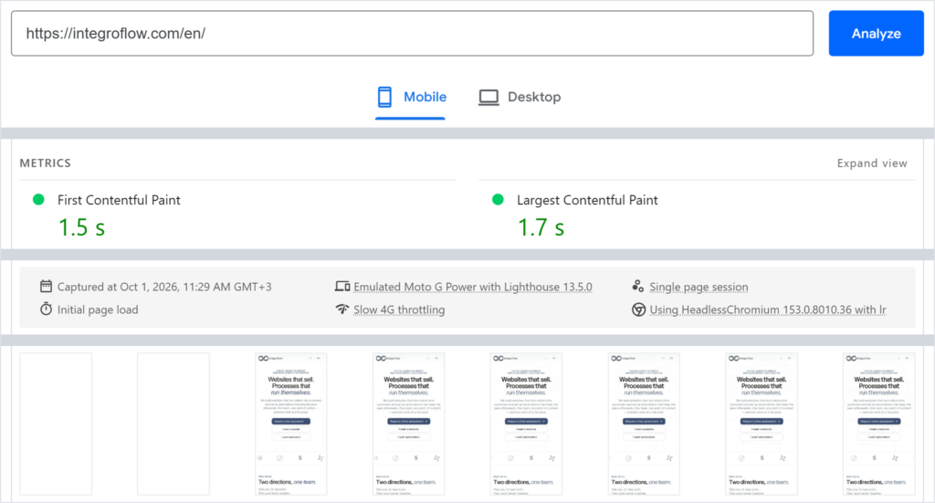
Open the home page and count the seconds until there is something you can read. Google draws the line for the main content at two and a half seconds. Anything far past that is worth asking about.
Fill in your own contact form and send it. Did anything arrive, in which inbox, and does somebody open that inbox on a Tuesday? Can you reply and reach the person who wrote in? A green message-sent notice answers none of that.
Count the clicks from the home page to the page that earns you money, whichever page that is. If you lose count, the site is built around your org chart, and your visitor has never seen it.
Search Google for your company name. Is your site the first result, and does the line underneath say what you would have said? A missing site has a short list of causes.
Last one, one second. Look for the padlock in the address bar, on the phone as well as the laptop. Certificates expire quietly.
Ten minutes, no tools. If one comes back wrong, you have something specific to ask for instead of a feeling that the site is not working.
What can’t you check yourself, and what should you ask for?
Roughly half of what makes a site good sits behind the page, where looking at it in a browser proves nothing. You cannot see whether a message from your form was accepted at the other end, whether an enquiry was counted twice, or whether a page tells search engines to skip it.
Take the form again. A message leaving a website passes through several hands: the browser reports it sent, the site records it arrived, a mail service accepts it, an inbox receives it, and somebody can reply to the sender. The green notice appears at the first of those. Our team has opened sites where it appeared while some messages were being rejected further down the line, and nobody was told.
Analytics has the same problem: it can count an enquiry twice, or stop counting after the cookie banner. Accessibility has a published standard, WCAG, and you can ask which parts a site meets.
Then there is what a site brought from the workshop: pages still asking search engines to stay away, addresses pointing at the build server, form notifications going to whoever built it.
What to ask for
- Ask
- Show me that messages from the site’s contact form are being delivered: the sending log for the last month, where failures are recorded, and which mailbox receives them.
- Caveat
- We cannot see your setup from here. On some configurations mail leaves the server correctly and is rejected at the receiving end, and from the site itself that is indistinguishable from a form that works.
- Check
- Ask them to send one while you watch, confirm it lands in the mailbox your team actually opens, and ask for the dated log entry for it.
Which of these stay good on their own, and which decay
Some of what makes a site good is decided once and then holds: what the site is for, how it is put together, whose name the domain is in. The rest wears out by itself, which makes it a different purchase: one you keep making.
| What it is | How you check it | Holds or decays | Who can fix it |
|---|---|---|---|
| What the site is for | Ten seconds on the home page: can you say it in one sentence | Holds | You, with whoever writes the text |
| Structure and page addresses | Clicks from the home page to the page that earns | Holds | Whoever built it |
| Control of the accounts | Log in yourself to the registrar that bills you for the domain, and to the host | Holds until somebody changes it | You, once |
| Speed on a phone | Seconds until the main content appears | Decays | Whoever maintains it |
| Forms reaching a real inbox | Send one, then reply to yourself | Decays silently | Whoever maintains it |
| A backup you can restore from | Ask when somebody last restored from one | Decays without a sign | Host or maintainer |
| Certificates and renewals | Padlock in the address bar, renewal dates in the accounts | Decays on a schedule | Host or maintainer |
| Content that is still true | Read a page you wrote last year | Decays | You |
That split is also the honest answer to whether a template is good enough. A ready-made theme carries the top half well; the bottom half has nothing to do with how it was assembled.
Everything below the line needs an owner, and the work is dull and continuous. Leave it long enough and the top half goes wrong too, and you are looking at a rebuild.
Which leaves the question the table cannot answer. If the form stops delivering tomorrow, who finds out first? What matters is whose phone lights up.
What to check before you accept a new site
Two things take one conversation the week before a site goes live and real money afterwards: who controls the accounts it runs on, and what is handed over with it. Neither is visible on the site, and neither comes up unless you raise it.
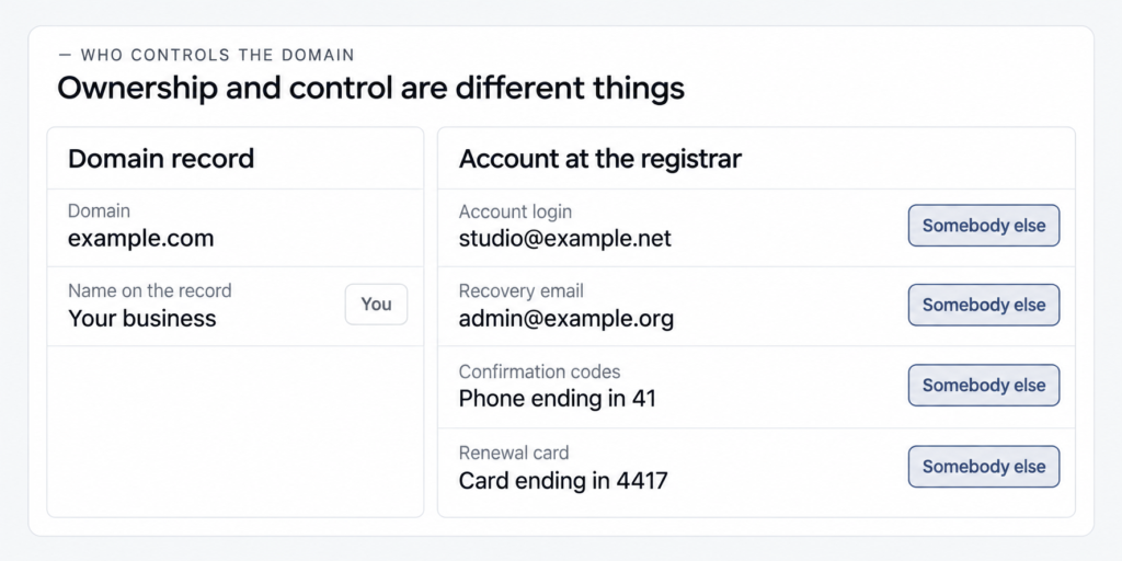
Ownership and control are different things. Most of the trouble starts in the gap. Your name can sit on the domain record while the account at the registrar belongs to somebody else, the recovery email goes to an address you have never seen, the confirmation code arrives on somebody else’s phone, and the renewal is charged to a card you do not own. Any one of those means you cannot move the domain.
The rest is a list you can ask for before signing anything off: which accounts exist and who holds each, what was checked before launch, known limitations in writing, how the site gets restored and by whom, and who gets told when it breaks.

Founder
I do not consider a website ready because its pages open and its forms show a success message. It is ready when we can prove that the full chain works, the client controls every critical account, and someone will be alerted when that chain breaks.
Dmitry
founder and web developer, IntegroFlow
Our team at IntegroFlow does not hand a site over until that list is filled in. None of it is exotic.
FAQ
Not by looking at it. Check how long until something readable appears on your phone, whether a message sent through your form arrives somewhere a person opens, how many clicks to the page that earns, and whether the site comes up when you search your own name.
Usually nothing you can see. Sites fail quietly: a form that reports success and delivers nothing, a first screen that takes six seconds on a phone, analytics nobody connected, a domain nobody on your side controls. The visitor never sees any of it. They just leave.
It has to look credible, which is a lower bar and a different one. Design earns attention and signals that somebody cared. It cannot make a slow page fast or an unclear offer clear. If you have to choose, spend the effort on what a visitor came to do.
It depends on how much of it is built and how much is assembled from ready parts: pages, text written from scratch, systems it talks to, languages it carries. The ranges and what shapes them are here: what goes into the price of a site.
Start with the domain
Of everything above, one check costs the least to run and the most to skip. Log in to your domain registrar yourself, today, and see whether you actually get in. If the answer is no, that is not a website problem any more. It is a business one.
The ten minutes divides neatly. Half of what you find turns into a specific question for whoever looks after the site. The other half needs access to the server, and that half does not stay fixed (worth knowing before you pick who does it).
That is how we build and hand over sites. If you are choosing somebody to do it, the same questions work on us.